Introducing Recap: What's Old Is What's New Again
Note: When I left Twitter to become an indie developer I committed to helping others with my work as much as I could. My goal has always been to make the lives of developers a little easier, so they can turn their ideas into, apps, products, and businesses. Every week this month I will be open sourcing something I’ve built for Plinky, my very own personal Open Source October. My career rests on the foundation that others have created, and I want to continue paying it forward by lowering the barrier for others to make what matters to them. Now, onto the post.
What’s New? Nm, what’s new witchu?
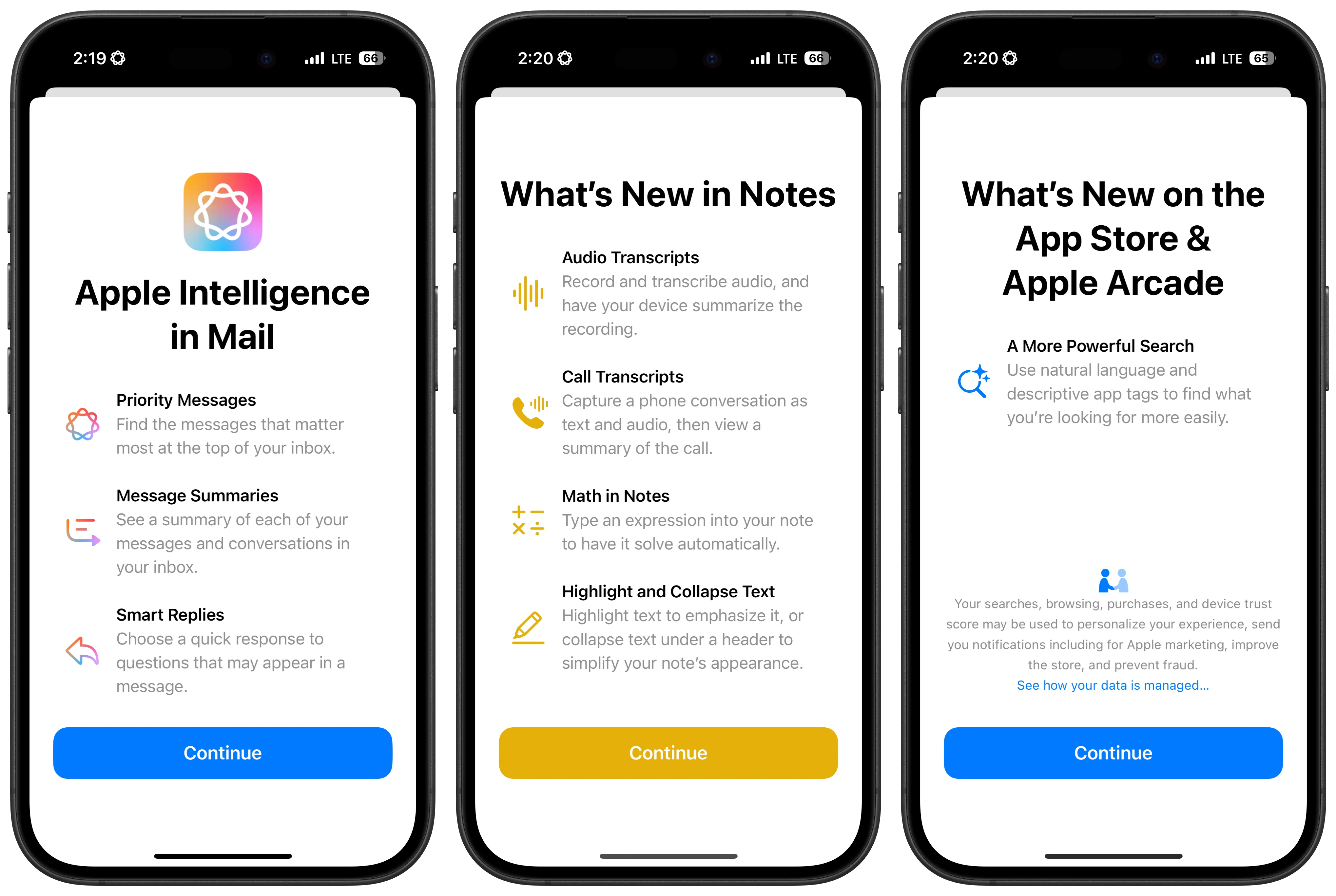
We’ve all experienced launching one of our favorite apps, and seeing it’s had a big update. When that happens you’ll be greeted by screen that says “What’s New”, even Apple’s apps do this. The What’s New Screen is a great way to use one of the few moments an app has a user’s attention, to let them know about the new value you’ve delivered.

Since launching Plinky I’ve released an update every month. With so many new features, I wanted to ensure that people know I’m adding a lot of value to Plinky. This led me to build my own version of a What’s New Screen, in a library I call Recap.
I had a few key priorities in mind when building my version of a What’s New screen:
-
Comprehensive version history: I wanted to showcase all the value I’ve added over time, so the What’s New Screen can scroll back through every major update. This is especially useful for new users, who can easily discover Plinky’s full feature set with each update.
-
Effortless updates: With monthly app releases, adding new features to the What’s New screen needed to be quick and straightforward. The release process is stressful enough, so I wanted to avoid adding more hurdles to it.
-
On-brand design: Plinky is known for being colorful, playful, and customizable. I wanted my What’s New screen to embody these qualities, while building Recap to fit in with any app’s design language.
I built a prototype of a What’s New Screen in a few hours, and quickly decided to open source the project. My goal is to help developers focus on what they do best — creating value for their users. By open sourcing code that solves common problems, I hope to contribute to that mission.
Recap
Recap is a What’s New Screen that requires just two lines of code to implement, but it offers much more. It delivers on all the priorities I mentioned earlier: it’s easy to integrate, highly customizable, and handles several common implementation challenges.
No Code Updates
Recap’s standout feature is its markdown-powered release list. Here’s how simple it is to implement:
// Initialize releases from a markdown file in your app's bundle
let releases = ReleasesParser(fileName: "Releases").releases

// Create and display the RecapScreen
RecapScreen(releases: releases)
Updating your What’s New Screen is as easy as editing a markdown file — no code changes required. The simple markdown spec lets you create new versions in minutes:
# Version Number
## Release Title
### Change Type

- title
- description
- symbol
- color
And here’s a concrete example of what a 1.0 release for Recap might look like:
# 1.0
## Introducing Recap 🥳
### Major

- title: Welcome to Recap
- description: It's live! 🥰
- symbol: party.popper
- color: `#F72585`
Customization

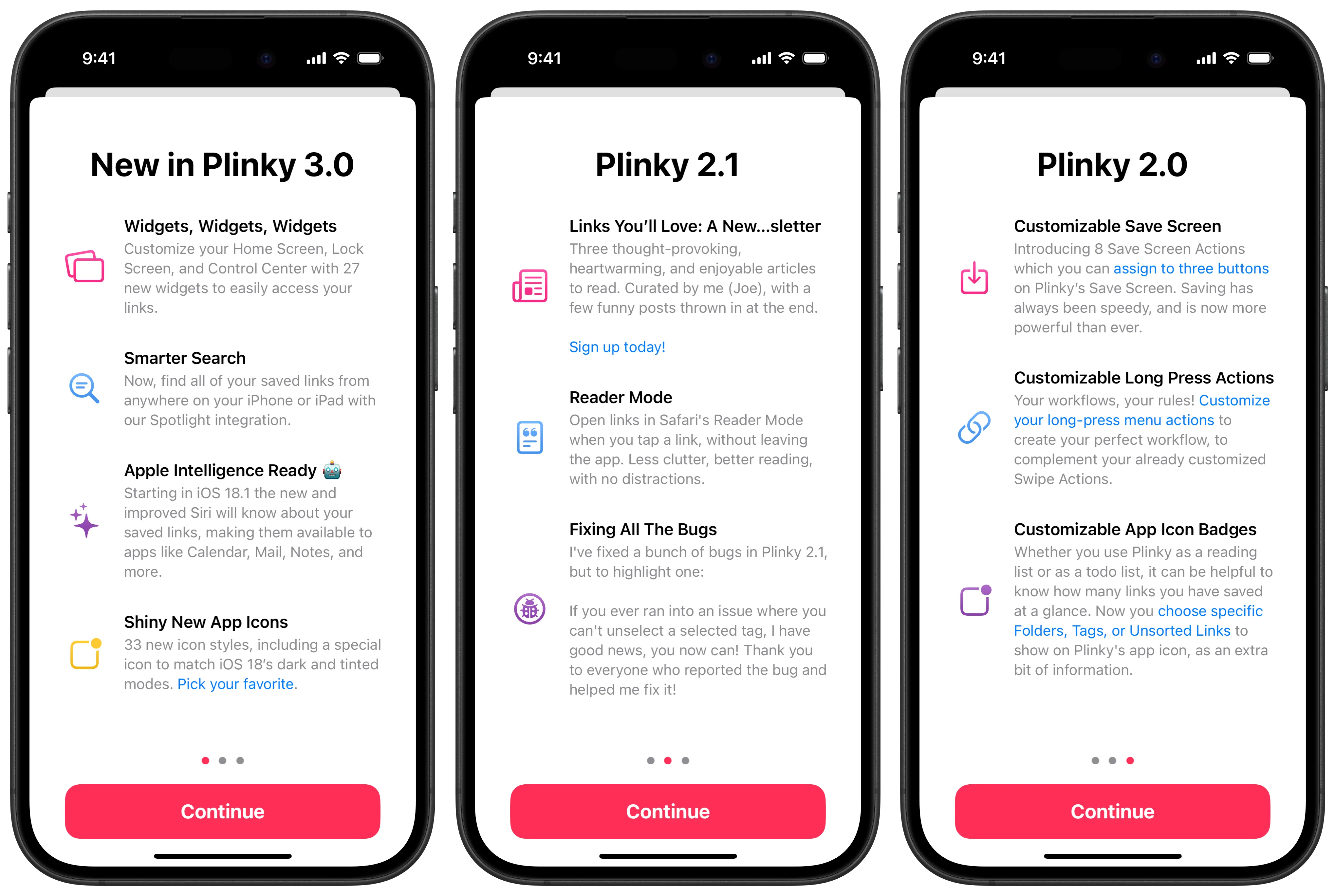
Now, let’s explore a more advanced example from Plinky. This version has icons, colors, gradients, and markdown support (including links). With just a bit of SwiftUI and markdown, we have a beautiful What’s New Screen. Each feature is defined by four elements: title, description, symbol, and color.
# 3.0
## New in Plinky 3.0
### Major

- title: Widgets, Widgets, Widgets
- description: Customize your Home Screen, Lock Screen, and Control Center with 27 new widgets to easily access your links.
- symbol: rectangle.on.rectangle.angled
- color: `#F72585`

- title: Smarter Search
- description: Now, find all of your saved links from anywhere on your iPhone or iPad with our Spotlight integration.
- symbol: text.magnifyingglass
- color: `#4895EF`

- title: Apple Intelligence Ready 🤖
- description: Starting in iOS 18.1 the new and improved Siri will know about your saved links, making them available to apps like Calendar, Mail, Notes, and more.
- symbol: sparkles
- color: `#8E44AD`

- title: Shiny New App Icons
- description: 33 new icon styles, including a special icon to match iOS 18’s dark and tinted modes. [Pick your favorite](https://plinky.app/open/appIcons).
- symbol: app.badge
- color: `#FFC933`
Looking closely you’ll notice a subtle gradient on each icon. This is achieved using one of the many recapScreen modifiers, allowing you to fully align the What’s New Screen with your app’s design language. Here are a few examples to customize the icon fill mode, dismiss button style, and page indicators:
RecapScreen(releases: releases)
    .recapScreenIconFillMode(.gradient)
    .recapScreenDismissButtonStyle(Color.pink, Color.white)
    .recapScreenPageIndicatorColors(selected: Color.pink, deselected: Color.gray)
Recap offers numerous customization options. You can adjust title colors, screen padding, backgrounds, and more. For a complete list of supported modifiers, I recommend checking out the documentation.
Version History
You may have noticed that there are multiple pages of releases — a core feature that inspired Recap. This allows users to browse all your app’s features, simply by adding multiple releases to your markdown file.
Recap also supports a leadingView and trailingView. In Plinky, I use these to showcase my roadmap on the first page and a support screen at the end. This is a nice way to keep users informed about upcoming features, and encourage their input.
RecapScreen(
    releases: releases
    leadingView: {
        UpcomingRoadmapView()
    }, trailingView: {
        SupportView()
    }
)
Semantic Versioning
Determining when to show your What’s New Screen can be tricky, and worst of all, you only know if it worked after an app update. To address this, I’ve integrated a flexible semantic versioning helper into Recap.
The SemanticVersion type converts string version numbers (like Bundle.main.object(forInfoDictionaryKey: "CFBundleShortVersionString")) into the familiar semver format. The parser is forgiving, handling versions like 1.0.0, 2.0, or 3 with ease.
Here’s an example of how to use semantic versioning to show the What’s New Screen only for major or minor version increases:
var shouldDisplayRecapScreen: Bool {
    let currentVersionNumberString = Bundle.main.object(forInfoDictionaryKey: "CFBundleShortVersionString") as? String
    let previousVersionNumberString = "1.0.0" // You should decide the best way to store the user's last launched version number, UserDefaults is a useful option.

	guard let currentVersionString, previousVersionString else { return false }

	let currentVersion = SemanticVersion(version: currentVersionString)
	let previousVersion = SemanticVersion(version: previousVersionString)

	return currentVersion.major > previousVersion.major || currentVersion.minor > previousVersion.minor
}
This will display the screen when updating from 1.0.0 to 1.1.0 or 2.0.0, but not for patch updates like 1.0.0 to 1.0.1.
What’s Next
We’ve covered the key features of Recap, but there’s more to explore. For a deeper dive, check out the code on Github. I believe Recap offers a simple yet powerful solution for What’s New Screens, adaptable to any app’s needs.
I have plenty of new features in mind for Recap, and I’d love your input. If you have any thoughts or suggestions, I’m always available on Threads. I welcome any and all polite discussions.