What the accidental Claude Code source code leak tells us about the real value of code, product market fit, and why integration is what actually makes software great.
The bar for shipping quality work hasn‘t lowered just because AI can generate code in minutes — and if you‘re accepting AI output without reviewing it, you‘re part of the problem.
Big companies are downsizing, not solely because of AI and corporate greed but because communication bottlenecks kill productivity and demoralize teams.
AI is making it cheaper and easier for anyone to build custom software solutions. The changes from this shift will be drastic, especially for SaaS companies.
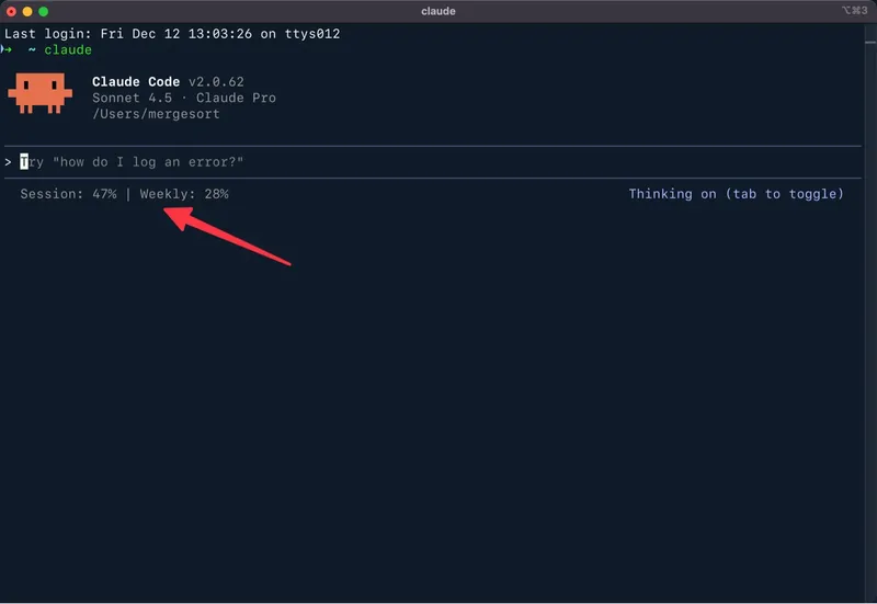
The sudden adoption of Claude Code by non-technical people represents an important moment in time — and one that will have a lasting impact on the way we work.
What the accidental Claude Code source code leak tells us about the real value of code, product market fit, and why integration is what actually makes software great.
The bar for shipping quality work hasn‘t lowered just because AI can generate code in minutes — and if you‘re accepting AI output without reviewing it, you‘re part of the problem.
Big companies are downsizing, not solely because of AI and corporate greed but because communication bottlenecks kill productivity and demoralize teams.
AI is making it cheaper and easier for anyone to build custom software solutions. The changes from this shift will be drastic, especially for SaaS companies.
The sudden adoption of Claude Code by non-technical people represents an important moment in time — and one that will have a lasting impact on the way we work.
Real-world examples of how I used ChatGPT over a four-day weekend, providing practical insights for anyone curious about working with large language models.
A personal framework for choosing projects: focus on either small projects for quick learning or large projects for meaningful impact, while avoiding the medium-sized trap.
A practical analogy for understanding and improving how you work with AI tools like ChatGPT and Claude, moving beyond tips and tricks to develop better judgment.
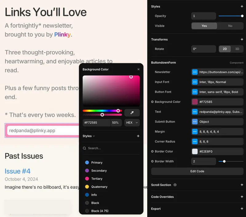
A technical walkthrough of building a customizable Framer Code Component for Buttondown email signups, complete with Property Controls and open source code.